By Garett Heineck
In my previous blog post, I discussed open source and commercial software that turfgrass scientists currently use to assess different variables. In this post, I will introduce a new image analysis technique that has been developed at the University of Minnesota using program R (packages: EBImage and randomForest). The system is based on open source software freely available to anyone. Currently, knowledge of the programming language R is needed with some additional skill in ImageJ.
For this demonstration we will analyze features of three second-year perennial ryegrass turf plots. As many turf managers know, second-year perennial ryegrass can have problems. For one, it is prone to winterkill often leading to dead patches that allow crabgrass to encroach into the turf. Secondly, the stems produced in the second year become straw-colored and unsightly in mid to late summer. This demonstration will showcase the utility of our technique using R to quantify aspects of this turf using a simple digital image and compare the results to visual ratings.
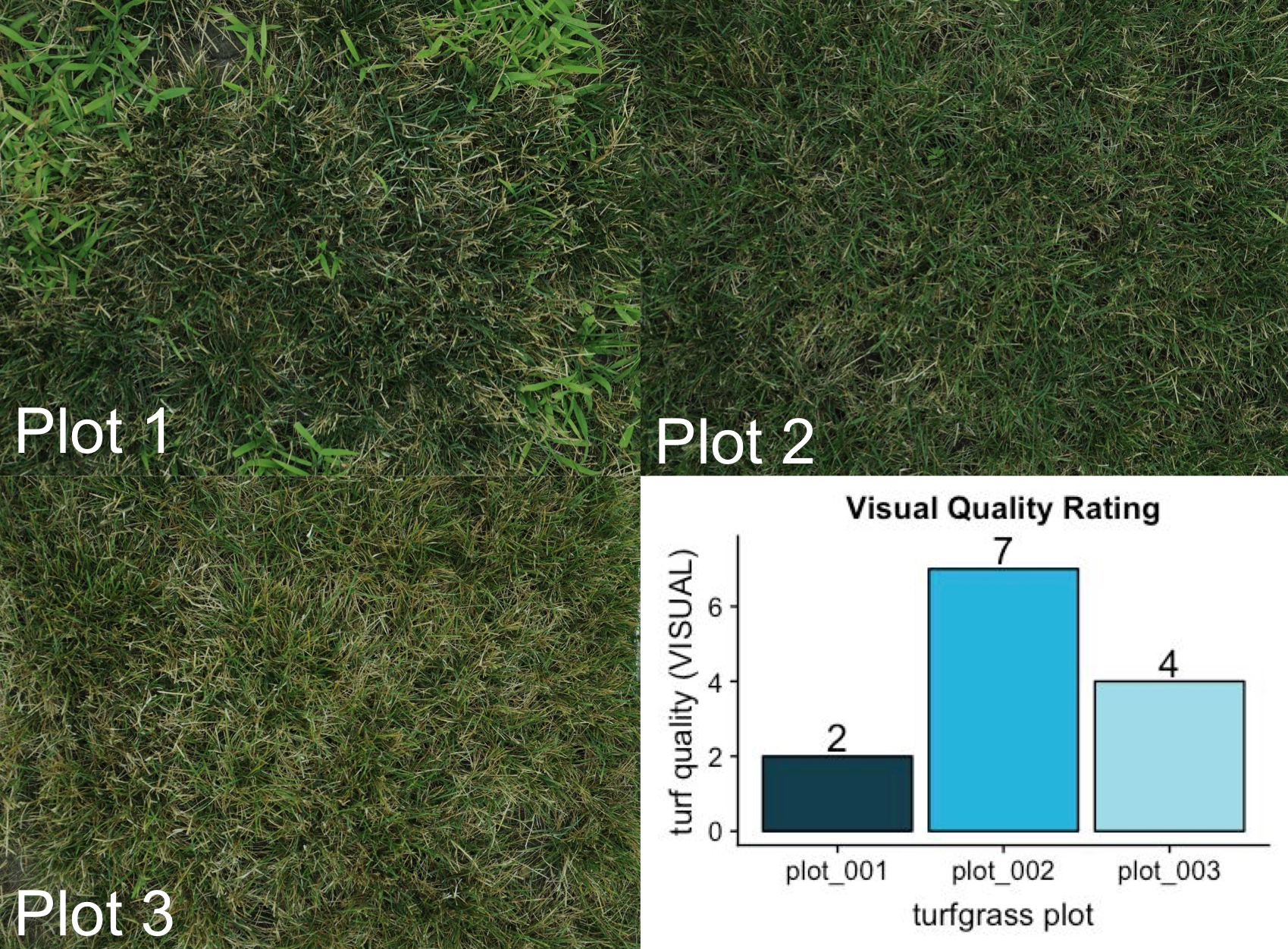
Below are three images (Figure 1) of second-year perennial ryegrass turf plots taken with a Nikon D300. Images of similar quality could also be taken with a new smartphone. This image has about 10 million pixels (3480x2848). Each pixel consists of three numeric values in an array (red, green, and blue). That means this image contains 30,000,000 data points! This brings new meaning to the phrase “a picture is worth a thousand words.”
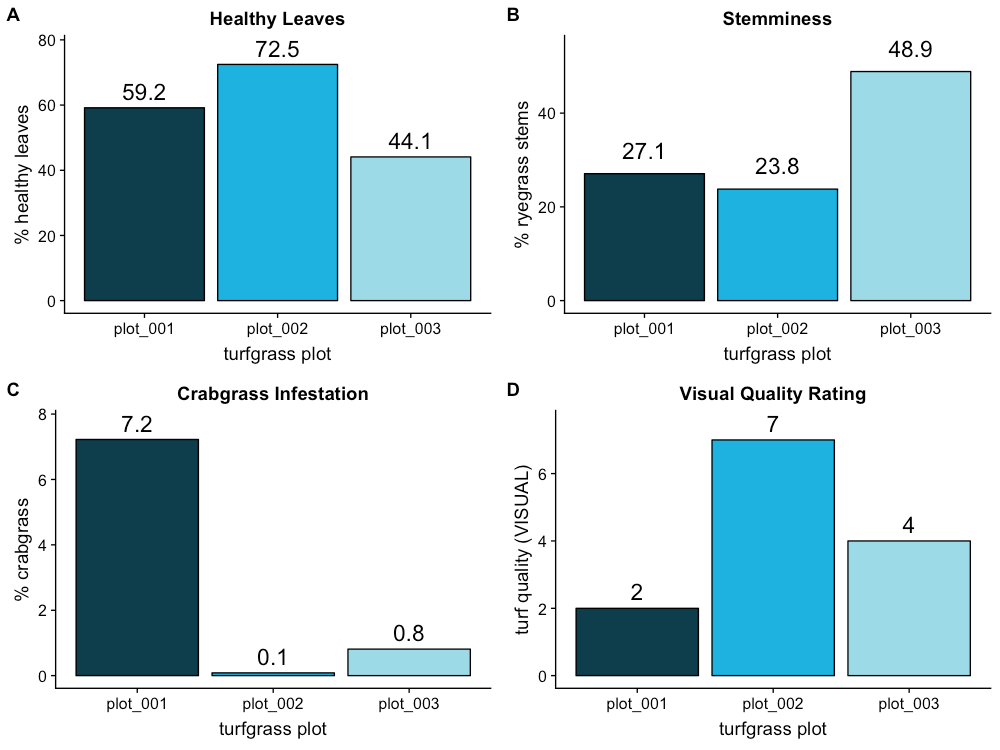
Visually, we can see major differences in turfgrass quality. My eye is immediately drawn to plot 2 as the most aesthetically pleasing, but why? Well, plot 1 has large clusters of crabgrass while plot 3 has a lot of stems and chlorotic leaves. These general observations are reflected in the graph above, where plot 2 has the highest rating. Let’s see if a computer can quantify features that could lead us to the same result as the turfgrass expert who conducted the visual ratings.
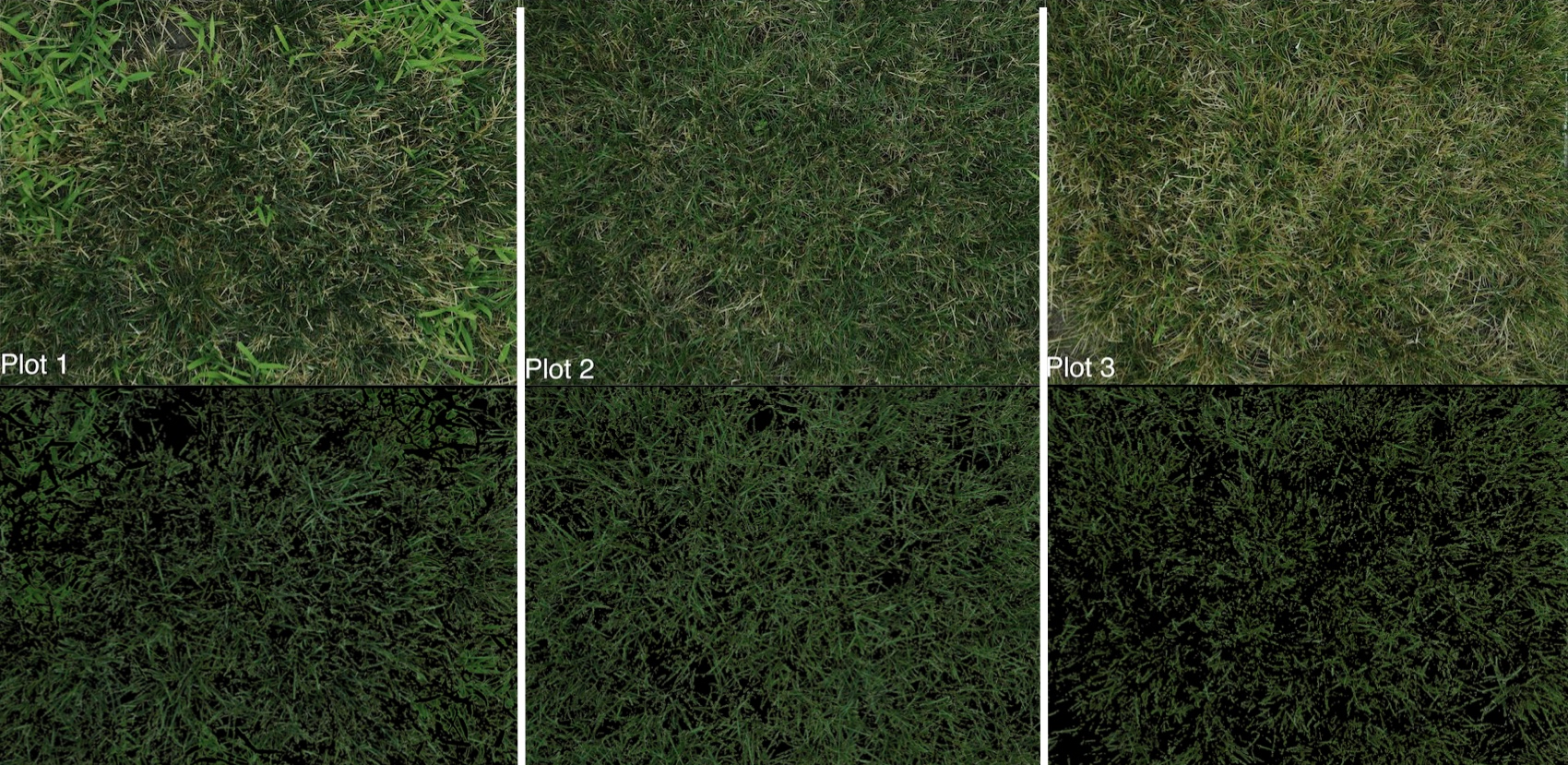
I first trained the computer to find healthy green tissue that was not crabgrass. A perfect perennial ryegrass plot would approach 100% of this category. The computer found that plot 2 had 72% healthy leaves while plots 1 and 3 had 60 and 44% respectively. If you look closely, you will see there are gaps in the second row of images indicating where there is not healthy turf (Figure 2).
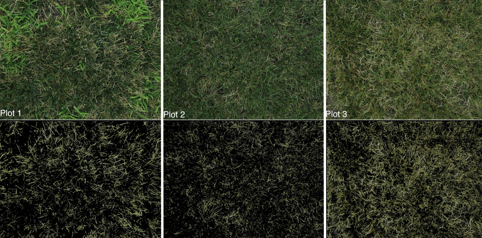
Next, the computer was trained on dried stems. The computer was easily able to separate stem tissue from the image (Figure 3). Stems not only depress the color quality of turf, but also degrade the texture, or feel of the turf. The computer found that plot 3 had nearly twice the area of stems as plots 1 and 2. A trained eye can see some stems in the original image, but the image output really augments your ability to assess the true amount of stems (Figure 3).
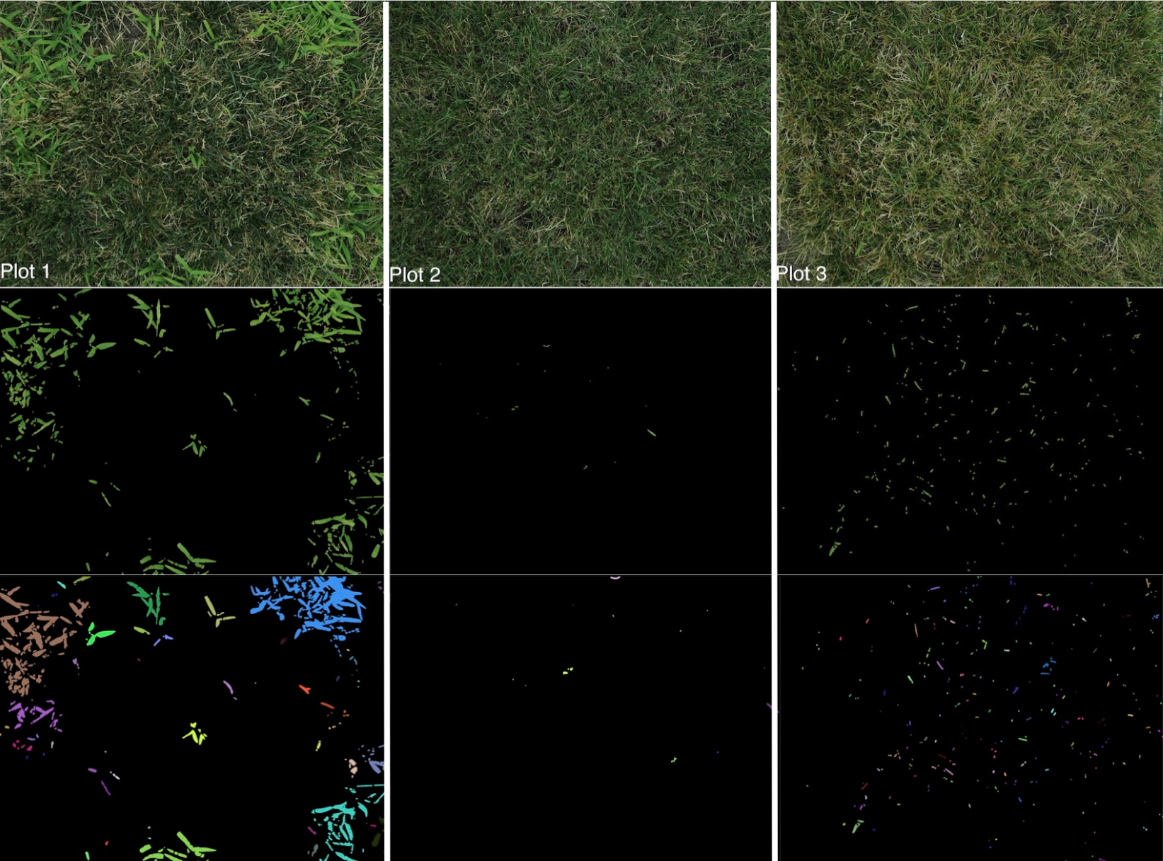
Once trained on the color and rough shape of the crabgrass, the computer separated it from the turf (Figure 4). The analysis output includes proportional and clustering information to help us observe the spatial patterns of crabgrass in the plots. You will also notice that the computer misclassified some objects in plot 3 as crabgrass (Figure 4). Visually, the crabgrass severely reduces the aesthetics of plot 1. However, image analysis reveals only 7% of plot 1 is covered by crabgrass!
The output of the analysis system includes several data points with each image that can be exported to Excel or analyzed in R. This way we can graphically see the differences in the three traits the computer measured (Figure 5 A, B, and C). It is interesting to note that plot 1 had substantial amounts of healthy turf even though we can see in Figure 5 D that it had by far the lowest rating. The reason for this is explained by looking at Figure 5 C and observing the almost 10-fold increase in crabgrass coverage. Plot 2 was likely rated a 7 out of 9 not only because it had the highest amount of healthy turf, but because it also had the lowest area of both stems and crabgrass. Measuring all three of these traits allowed us to empirically describe the rating decisions of a profession turfgrass breeder with over fifteen years of experience.
This new method provides valuable information using open source software and can be adapted for multiple uses. In particular, we have found this system highly adept at quantifying crown rust severity in perennial ryegrass. We hope that in the near future this can be made into an app that is easier and more user friendly. All the images seen in this post along with the R code to process them can be found on this GitHub page.
